Public Radio Dashboard
Funneling crucial station data into a shared interface to increase organizational transparency.
A Customizable KPI Tracker
We led a participatory design effort to identify WBUR's key operational metrics and determine how to best share them across the station. After coaching senior managers to incorporate measurement and feedback cycles into weekly meetings, we developed a new cloud-based platform to support this practice across public media.
Analytics Audit
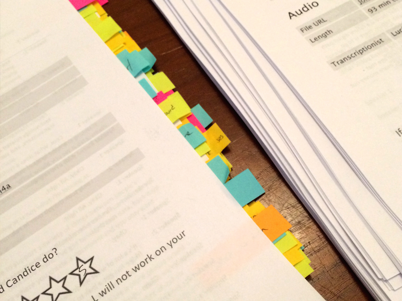
We began the project by speaking with 22 members of the organization who gathered, interpreted, or relied upon statistical data at WBUR, and created a 15-page ethnographic report detailing our findings.
By sharing a holistic understanding of the organization with its leadership, we developed a common frame of reference about current strengths and weaknesses that allowed us to create grounded solutions for the problems we identified.
By sharing a holistic understanding of the organization with its leadership, we developed a common frame of reference about current strengths and weaknesses that allowed us to create grounded solutions for the problems we identified.
Operations Upgrade
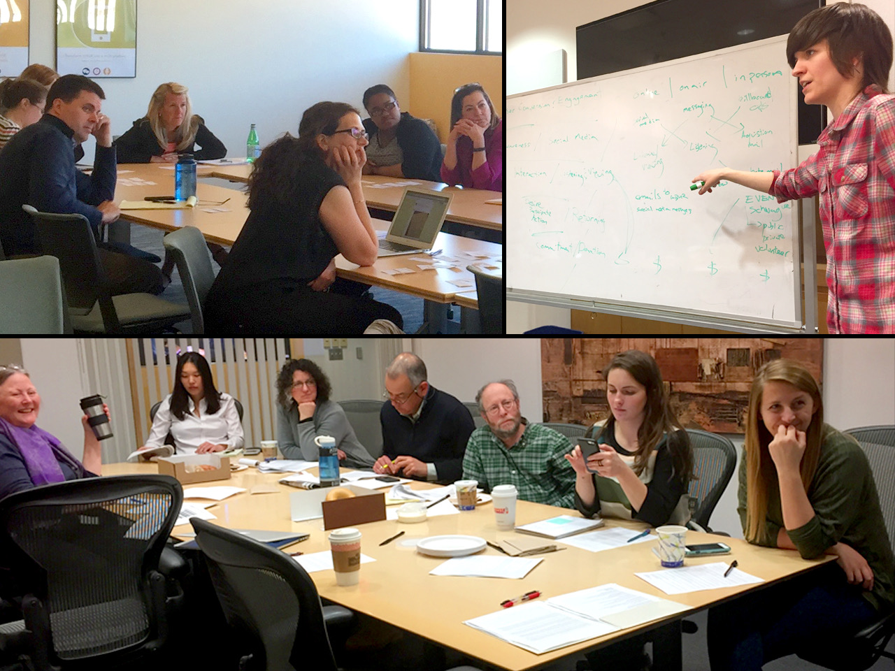
After the audit, we created a three-month curriculum to improve data literacy at the station. We coached WBUR’s leadership through the course of translating their high-level strategy into actionable plans with quantifiable results.
By facilitating weekly leadership meetings, we worked with station managers to come to a consensus about what metrics they needed to be tracking and sharing on a station-wide basis.
By facilitating weekly leadership meetings, we worked with station managers to come to a consensus about what metrics they needed to be tracking and sharing on a station-wide basis.
Visual Prototype
As station staff began to see the interrelation of each department's KPIs, we engaged them in a participatory design process to imagine what a station-wide analytics dashboard might look like.
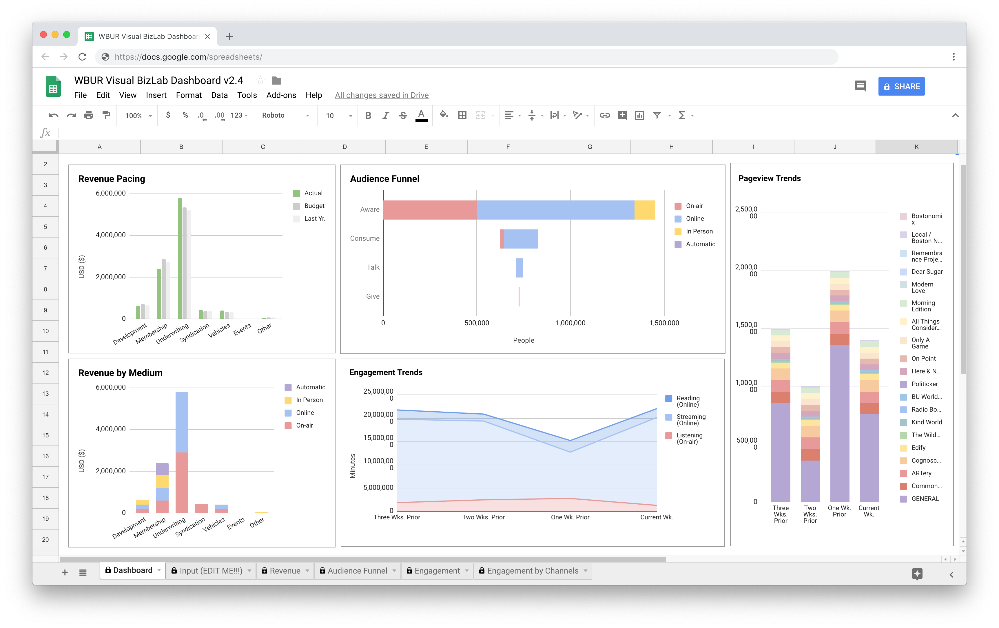
Pushing Google Sheets to its limits, we developed a prototype system for everyone at the station to use. By the time the operations upgrade was complete, staff members were reporting and reflecting on over 180 common metrics every week.
Pushing Google Sheets to its limits, we developed a prototype system for everyone at the station to use. By the time the operations upgrade was complete, staff members were reporting and reflecting on over 180 common metrics every week.
Adaptable Interface
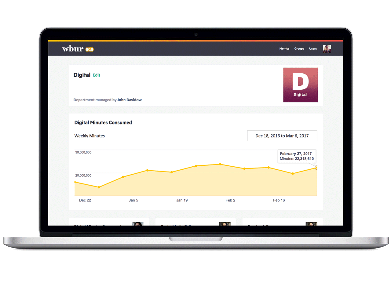
Learning from how the prototype was used, we developed a full-fledged analytics platform for public radio. The Dynamic Growth Dashboard allows a station to track, share and visualize virtually any metric their team members need to monitor.
Daily podcast downloads sit side-by-side with monthly membership donations and quarterly Nielsen reports. Built using Ruby on Rails and Google Charts, the web-based dashboard was previewed in summer 2016 at the Public Media Development and Marketing Conference.
Daily podcast downloads sit side-by-side with monthly membership donations and quarterly Nielsen reports. Built using Ruby on Rails and Google Charts, the web-based dashboard was previewed in summer 2016 at the Public Media Development and Marketing Conference.
Questions?
[email protected]